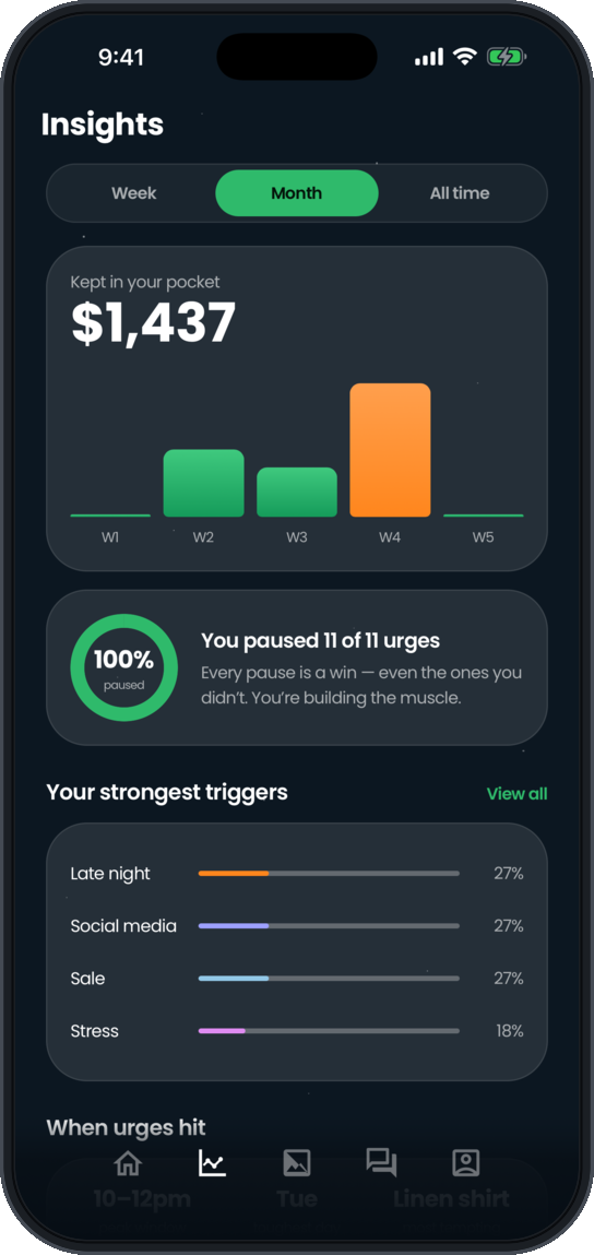
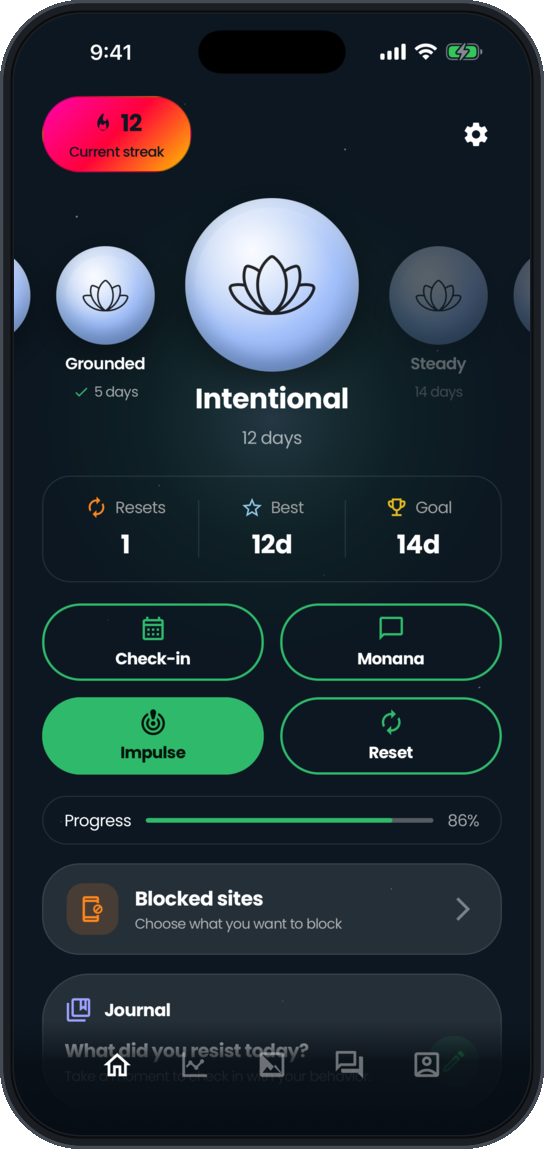
01 · Overview
A different moment to support.
Many financial tools focus on what happened after a purchase. ANKrD explores a different moment: the few minutes between wanting something and deciding whether to buy it.
The product is designed around a simple idea:
Feel the urge. Pause. Reflect. Choose.
A successful moment does not have to mean walking away from a purchase. Someone might pause, think it through, and still decide to buy. The goal is to make the decision intentional rather than automatic.
02 · The opportunity
Shopping can become a response to stress, boredom, loneliness, or the excitement of finding something new. In those moments, a traditional budget screen may not be what someone wants to open.
I wanted to design an experience that meets people in the moment, without judgment and without requiring them to connect a bank account.
ANKrD focuses on a short interruption in the shopping journey, giving users a chance to check in with themselves before deciding what to do next.
03 · My role
As founder, product designer, and builder, I worked across the product from early definition through a working frontend.
My work included:
- 01Defining the product concept, core experience, and scope
- 02Designing the brand direction, user flows, and visual system in Figma
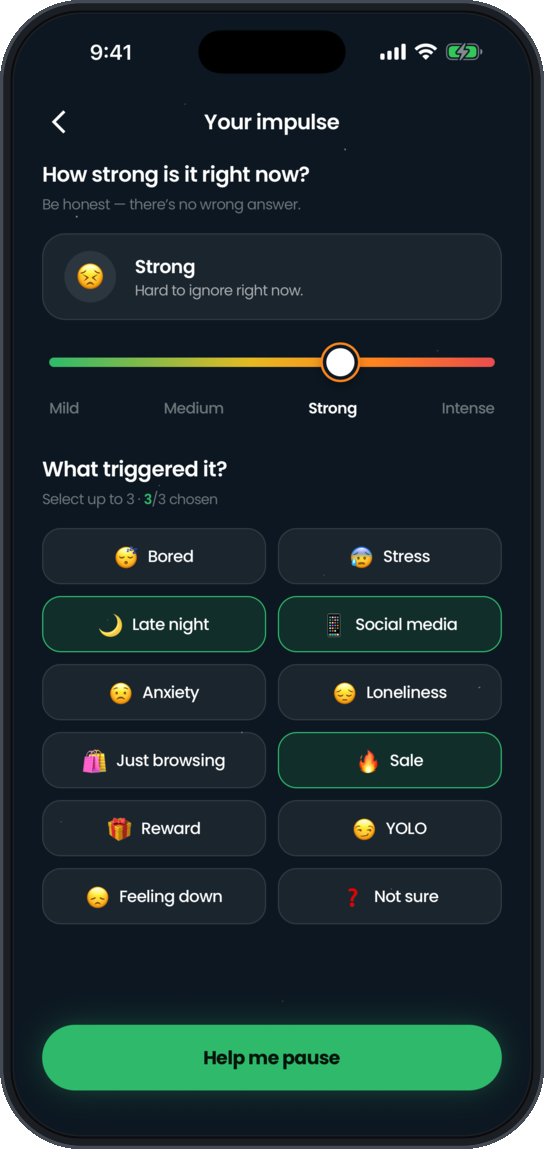
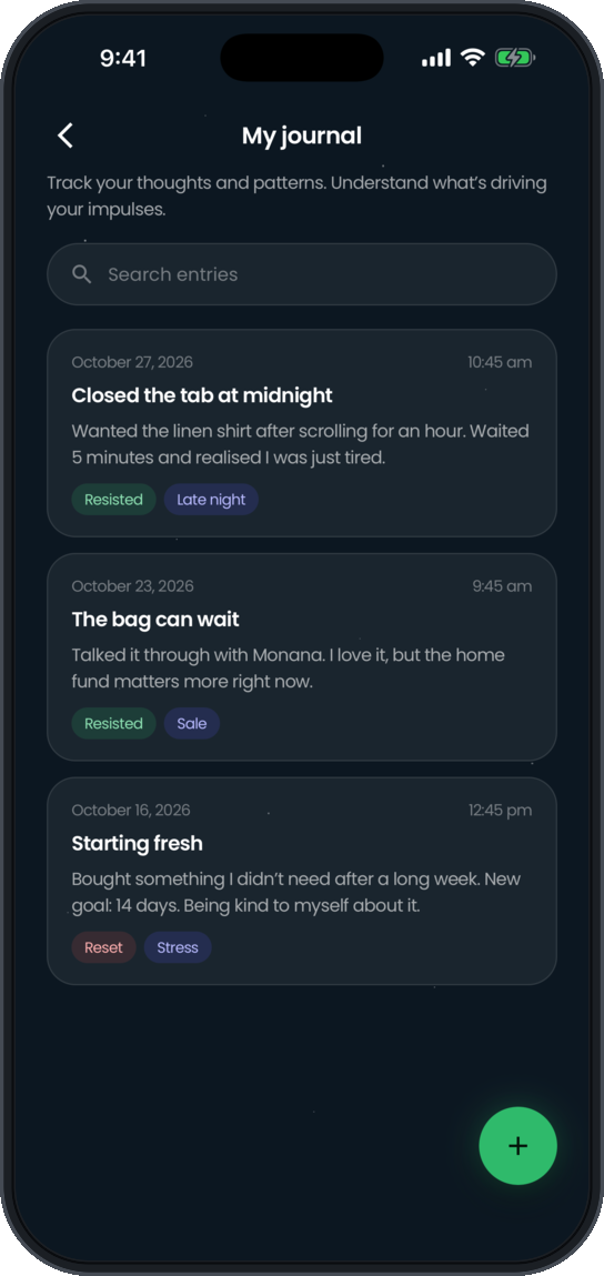
- 03Creating the onboarding, impulse check in, reflection, and progress experiences
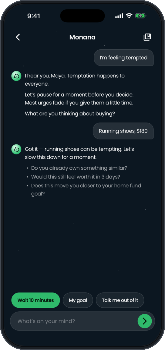
- 04Designing Monana as a calm, supportive companion
- 05Shaping the app’s approach to privacy, tone, and user choice
- 06Working with Claude Design and Claude Code to translate the designs into an Expo app
- 07Reviewing the product and planning the work still needed before launch
04 · The core experience
A small pause with room to choose.
- 01. Check inThe user rates the strength of an urge and can select up to three triggers.
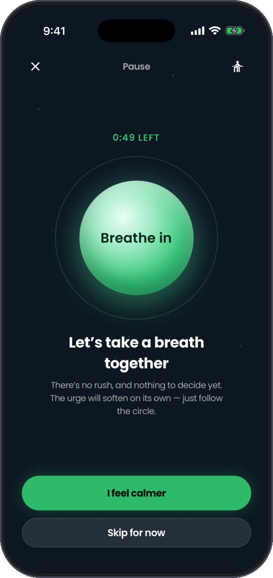
- 02. PauseThe app offers a moment to slow down, including a timer and calming activities.
- 03. ReflectThe user can spend time with Monana, write privately, or revisit a personal reason for changing their shopping habits.
- 04. ChooseThe user decides what to do next. Buying remains a valid choice. ANKrD is designed to support the decision, not control it.
05 · What I designed and built
06 · Designing without shame
Support, not control.
One of the most important product decisions was how ANKrD should respond when a user is struggling.
I did not want the experience to punish someone for buying something or make them feel as though they had failed. The tone is calm and encouraging, and the product makes room for users to make their own decisions.
That principle shaped the language, the reset experience, and Monana’s personality. Monana is designed as a supportive companion, not a therapist or financial advisor.
07 · Design decisions
08 · From design to a working app
I designed ANKrD in Figma, then used Claude Design to create a detailed design handoff covering 72 screens and states.
Using that handoff as a reference, I worked with Claude Code to build the frontend in React Native and Expo. The core areas are connected through data stored on the device.
The project also went through a code review covering areas such as data safety, urge tracking, timers, and interface behavior. Issues found during that review were addressed, but a complete product walkthrough and Android testing are still ahead.
09 · Current status
Built, with more work ahead.
ANKrD has not launched. The main app is built and runs in the iPhone simulator, but it has not been fully tested. Android testing and my complete walkthrough are still to come.
Before launch, the product also needs connected authentication and subscriptions, live AI for Monana, and additional work on planned features such as blocking and a real community.
A launch around January 2027 is being considered, but the timing has not been finalized.
10 · What this project shows
ANKrD shows how I approach a sensitive behavior problem through product strategy, thoughtful language, and interaction design.
The product is not built around telling people what they are doing wrong. It is built around creating a small moment of space so they can make a decision for themselves.
It also reflects how I move from an early idea through a complete visual system and a working app, while being clear about what is built, what still needs testing, and what is planned.